
You can't expect prospects to remember every word of your pitch.
Hell, you probably shouldn't assume they're going to listen to the entire presentation.
For instance, according to research, our attention span typically wanes every 10 – 15 minutes.
You can however help them remember the most important parts (and even listen more attentively).
How?
By using visual aids and clues highlighting the key messages of your pitch.
I've already showed you how to overcome this problem when delivering product demos.
And today I'm going to show you 5 presentation design styles that will help ensure the audience remembers your pitch.
Ready? Let's get cracking then…
What is the Takahashi Method?
You know:
Sometimes the best way to make an impact is by putting your message boldly right in front of the audience.
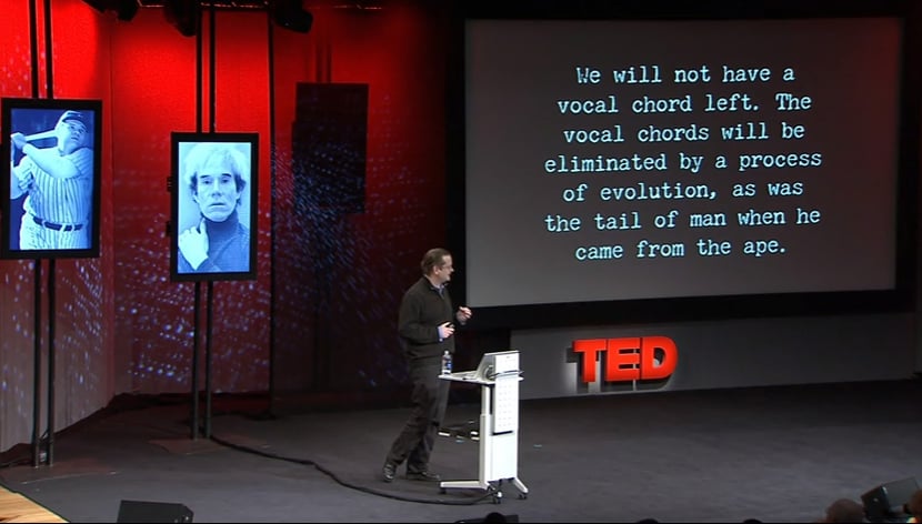
At least that's the premise of the first presentation style on my list, the Takahashi method, named after its creator, Masayoshi Takahashi.
When constructing his presentations, Takahashi uses only text set in a large type on a solid background, isolating the main message of his current state of speech.
According to Takahashi, his goal for using one or just a handful, yet ideally no more than three words, set in a very large type is to deliver a high-impact message in a very short period of time.
Takahashi believes that featuring bullet points or block of text on presentation slides forces the audience to read them instead of listening. Including only the key message however leaves them with nothing else to do but to listen to you instead (while the large type embeds the message in their memory).
You can see Takahashi delivering a presentation here (note: the video is in Japanese but it still gives a good impression of how his method works.)
One drawback of the Takahashi's method is that in order to communicate each important section of your pitch, you'd need to create a larger number of slides than when using a traditional, bullet point style.

What is the Lessig Method?
The Lessig Method is a presentation technique that synchronizes slides with the speaker's presentation. Specifically, this method uses images, quotes, and text to stimulate the audience and emphasize key points. The dynamic approach was coined by Lawrence Lessig, a law professor at Stanford University.
Do you remember Bob Dylan's video for the Subterranean Homesick Blues? If not, here's a reminder.
The premise of this revolutionary at a time clip was to sync slides with words sang by Dylan.
Funnily enough, this is also the premise the Lessig Method.
Lessig method is dynamic in approach, stimulating the audience to focus on the key messages behind the presentation.
Here's how Lessig slides look like in action:
And here you can watch Lawrence Lessig's TED talk to see this presentation style in action:
Note: given the way TED talk is recorded, you can't experience those slides in full.
So here's another example of Lessig slides in action. This time, you can only see the slides and hear the presenter's voice, giving you a good sense of how these slides work in the context.
The Monta Method
The next style is based on … a famous TV show host in Japan, Mino Monta.
You see, when introducing a new topic in his daily program, Monta often holds a board filled with questions and answers. Yet he typically keeps replies covered by strips of paper (or colored bars if he uses a board on screen).
Then, when he's ready to give the answer, he peels off the strip revealing the answer.
According to Shinichiro Oba, one of the first speakers to apply this technique in business presentations, hiding parts of text blocks or graphics on a screen elicits curiosity in the audience.
In turn, involving the audience in the presentation by asking questions and letting them to guess the answer before revealing the correct (and typically shocking and unexpected one) helps to build an emotional connection and keep the listeners engaged.
The Kawasaki Method
FACT:
When you're trying to get someone to agree with you, you need to present a pitch that's short, easy to absorb and simple to apprehend.
And there seems to be no better style to achieve it than the Guy Kawasaki's 10.20.30 rule.
The method is simple:
Display 10 slides in 20 minutes with text on each slide set in a 30pt font.
What's more, Kawasaki's slides typically consist of one key message spelled out, nothing else.
Here's his reasoning behind the method:
"Ten is the optimal number of slides in a PowerPoint presentation because a normal human being cannot comprehend more than ten concepts in a meeting.
Twenty Minutes. […] In a perfect world, you give your pitch in twenty minutes, and you have forty minutes left for discussion.
Thirty-point font. The majority of the presentations that I see have text in a ten point font. As much text as possible is jammed into the slide, and then the presenter reads it. However, as soon as the audience figures out that you're reading the text, it reads ahead of you because it can read faster than you can speak. The result is that you and the audience are out of sync."
Here's a great video of Guy Kawasaki explaining his method.
The Godin Method
The final method on the list, professed by the best-selling author and entrepreneur, Seth Godin focuses on using images to support your pitch.
In his booklet, "Really Bad Powerpoint (and how to avoid it)" Godin explains:
"The purpose of PowerPoint is to communicate with your audience. Unfortunately, rather than communicating, PowerPoint is used to accomplish three things, none of which leads to a good presentation.
The first thing that most people use PowerPoint for is a teleprompter! Think of all the presentations you've been to where the presenter actually reads the slides. Did your audience really have to come all this way to a meeting to listen to you read the slides? Why not just send them over?
The second task is to provide a written, cover-your-ass record of what was presented. By handing out the slides after the meeting (or worse, before), the presenter is avoiding the job of writing a formal report, and is making sure that she can point to the implicit approval she earned at the meeting.
The third task is to make it easier for your audience to remember everything you said. Sort of like reading your slides, but better. After all, if you read your slides, and then give the audience a verbatim transcript of what you read, what could be wrong with that?"
He then concludes:
"Make slides that reinforce your words, not repeat them".
Godin's design style focuses on creating an emotional, interesting and highly visual presentation in which the bulk of storytelling is delivered by visuals not words. He focuses on presenting slides that reinforce the message of the presentation and trigger an emotional reaction from the audience.
Here are a couple of Godin's slides from the "On Tribes" presentation that best illustrate his style:

(watch the entire presentation here)
And here's Godin's TEDtalk showing his use of images in action.
Which one should I adapt for my next pitch?
Good question!
And you know what:
The best way is to pick a style that matches your presentation personality.
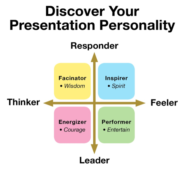
If you want to be a person Jim Teteak calls a Fascinator and share information that reassures your audience that you are a valuable resource, use the Lessig's method.
As an Inspirer, someone who strives to build rapports and enjoys sharing their feelings with the audience, you could choose between Seth Godin or Masayoshi Takahashi styles.
If you naturally tend to fire up your audience's energy and have the Energizer personality, design your slides in a way Seth Godin or Guy Kawasaki do.
And finally, if you're a natural Performer, then the Monta method will work best for you.
So…What do you think?
Which of these 5 styles would work for your presentation personality?