Table of Contents
- What are dashboards in Salesforce?
- How to create a Salesforce dashboard?
- Key Salesforce dashboards
- Main components of a Salesforce dashboard
What are Dashboards in Salesforce?
Salesforce dashboards are powerful visual tools that give sales teams instant insight into their most important metrics. By aggregating data from reports, dashboards provide a clear, real-time view of activity, pipeline health, performance trends, and more—all in one place.
Instead of digging through spreadsheets or individual reports, sales leaders and reps can use dashboards to monitor progress toward goals, spot bottlenecks in the pipeline, and make faster, data-driven decisions. Whether you're tracking closed-won opportunities, lead conversion rates, or team productivity, dashboards help translate raw data into actionable insights that drive smarter selling.
How to Create a Salesforce Dashboard [Step-by-step Guide]
Creating a Salesforce dashboard is easier than you might think—and it can be customized to match the specific goals of your sales team. Follow these simple steps to build a dashboard that delivers real-time insights and boosts sales performance:
1. Choose the Right Reports
Dashboards are built from reports, so start by identifying the key metrics you want to track—such as pipeline stages, activity levels, or deal size. Make sure the reports are in the "Summary" or "Matrix" format, as only these can be used in dashboards.
2. Navigate to the Dashboards Tab
Go to the "Dashboards" tab in Salesforce and click "Create New Dashboard". Give your dashboard a name that reflects its purpose (e.g., Sales Team Performance or Monthly Pipeline Overview).
3. Set the Dashboard Folder and View Settings
Decide where to save your dashboard—public or private folders—and set view access accordingly. You can also choose to display the dashboard as yourself or another user, depending on whose data needs to be shown.
4. Add Components (Widgets)
Click "Add Component" to start visualizing your data. Choose from charts, tables, gauges, metrics, and graphs. For instance, you can create a pie chart to represent lead sources or deal stages at a glance, making it easier to interpret your data visually. Each component is linked to one of your saved reports, so select the format that best represents the data (e.g., bar chart for revenue trends or pie chart for lead sources).
5. Customize Layout and Filters
Drag and drop components to organize the dashboard layout. Use dashboard filters to allow viewers to toggle between different data sets—like regions, products, or sales reps—without creating multiple dashboards.
6. Preview and Save
Once you're happy with the layout and data, click "Save" and "Done". Your dashboard will now display real-time insights based on the most recent report data.
5 Salesforce Dashboards You Should Be Using
To get the most out of Salesforce, it’s essential to focus on dashboards that directly impact sales performance. The right dashboards help sales teams track progress, identify roadblocks, and forecast results with greater accuracy. Below are five high-impact dashboards every sales-driven organization should consider using—each designed to boost visibility, drive smarter decisions, and keep revenue goals on track.
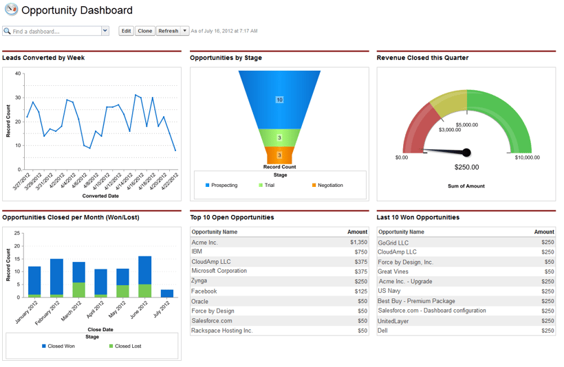
1. Sales Funnel Dashboard
You can do that by following every sale using a sales funnel. That analysis will empower you to maximize your profit potential.
The sales funnel dynamic dashboard lets you handle the funnel in real-time as you come to understand the different stages of your sales.
What is it?
The sales funnel dashboard makes sense of the value of your sales. As the name implies, it’s shaped like a funnel, with potential customers (or leads), at the top, filtering down to sales at the bottom.
Each sale typically goes through a series of different stages:
- Prospect Stage: This involves attracting the leads as you accumulate a list of potential customers.
- Investigation Stage: Follow up on leads, make appointments, and schedule meetings.
- Negotiation Stage: Now, it’s time to close the deal. It may mean bargaining with them, as you both come to an agreement.
- Conversion: The sale has gone through, and you’ve made a profit while retiring quota.
Why use it?
One of the key insights these dashboards in Salesforce can deliver is which part of the sales process you need to improve. Do you need to generate more leads? If the answer is yes, then you probably need to put more into your marketing budget.
Did you know 51% of sales leaders manage deeper connections with their clients? You need to keep track of that success somewhere.
If you create a dashboard using these metrics, you can also use it to:
- Rank leads
- Improve marketing
- Increase conversion rate
These Salesforce dashboards empower you to view multiple sales processes each step of the way. They’re also helpful in calculating whether or not the leads you’re generating are big enough to meet the demands set by your forecasts.
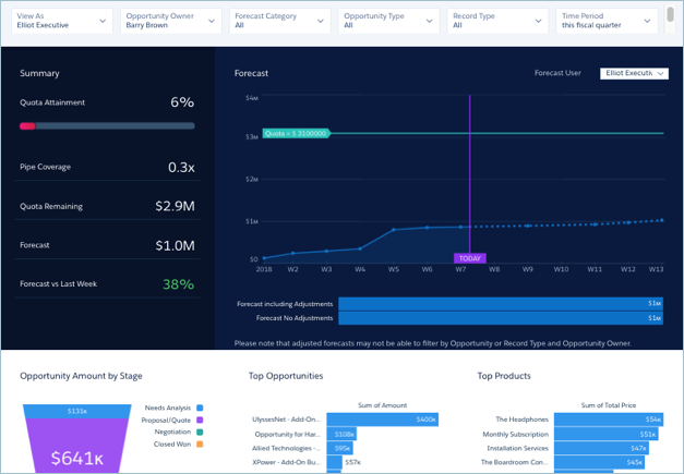
2. Forecast Dashboard
Everyone needs goals.
The forecast dashboard is ideal for both you and your staff to help track targets and KPIs. Your company will get a clear idea of its sales forecasts for the quarter.
This particular dashboard gives you a clear picture of where you stand with those forecasts.
What is it?
These dashboards in Salesforce organize all your forecasts for the company. Once you have a clearer outlook, you can use the data to help drive sales.
There are several types of forecast reports, including:
- Representative: Forecasts given by set representatives.
- Employees: Individual employee forecasts.
- Stage: Forecasts projected for certain sales stages.
- Team: Projections of team workforces.
- Territory: Forecasts based on the status of your territory.
Those all need to be accounted for, which the dashboard can manage.
Why use it?
Every business needs targets to hit — it’s just a case of finding them. The forecast dashboard can help you organize those targets. Focusing on sales quotas and quota attainment rates, it uses employee reports to generate predictions.
The dashboard also provides proactive guidelines for any new employees to follow. You can then train and coach them towards meeting their targets and tracking their KPIs. Using the goals set out by the quarterly forecasts, you can plan with efficiency.
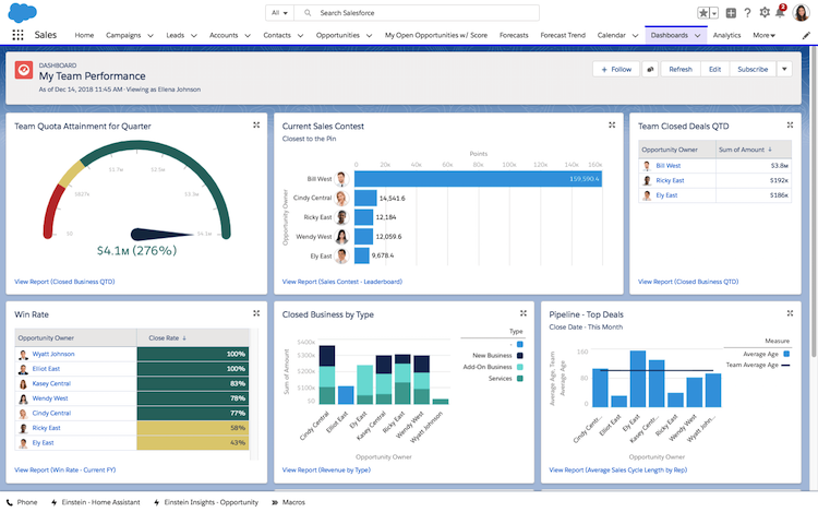
3. Leaderboard Dashboard
Inspiring others is vital to being a leader.
Another key part of leadership is a healthy competitive streak. Using the leaderboard dashboard, you can create a way to motivate the team with a little healthy competition and celebrating successes of the team as a whole. Much like a gamified system, this dashboard introduces employee ranking to help drive sales forward.
What is it?
The leadership dashboard uses revenue earned to identify the leading salesperson. In turn, that offers the sales manager insight into their group. They can then gather a complete overview of exactly where their strengths and weaknesses lie.
The leaderboard visualizes active engagement between employees and runs to a schedule. Offering a real-time analysis of everyone’s sales, it shows data provided by individual employees and teams.
Here are a few driving factors behind the leaderboards:
- Progress/Achievement: Shows each employee their current standing and how far they’ve come.
- Status: Everyone wants to increase their rank on the boards, as it also shows a real-time visualization of their profits earned.
- Top Salesperson: Includes the top-ranking employee. This target helps everyone else aspire towards success.
- Goals and Targets: Gives employees a set target. These goals let them know how much work they have.
You drive reports using factors determined through the business model. So it could be that you’ve increased downloads on your website. In that case, you require a tally of all the active downloads.
Why use it?
With a clear graphic interface and real-time data, the leaderboard dashboard provides round-the-clock motivation. Using that competitive spirit as motivation, it’s a powerful driving force.
It’s also ideal for sales managers looking to gain a tighter rein over their team. The results give them a complete rundown, showing where they need to concentrate their efforts.
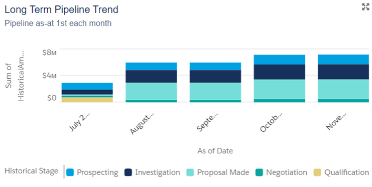
4. Pipeline Trend Dashboard
You need to see where things are heading with your business.
Nobody wants to find out about a sales slump before it’s too late. That’s where the pipeline trend dashboard comes in. It provides an interactive look at your business in real-time and analyzes whether sales are increasing or decreasing.
What is it?
Running on the first of each month, this dashboard shows the pipeline trend up to that point. You can find either long-term or short-term trends. Both of those work to show how sales cycles are progressing in any given period.
You get a snapshot of the pipeline on a set date. Presenting this data in real-time, you have it all immediately to hand. A few trends may include:
- Downward Pipeline Trend: This means the pipeline size is decreasing.
- Negative Pipeline Trend: Shows early signs of a slump.
- Positive Pipeline Trend: Early signs of increasing activity.
- End of Year Sales Pipeline Trend: Overall activity for the year and deals closed.
Why use it?
You can use the pipeline trend dashboard to identify where your strengths and weaknesses lie.
For example, you might be profiting during a set period in the summer. Using the short-term pipeline trend, you can pinpoint its origin. If you had a sale during that time, that proves it was a success.
- Long-Term Pipeline Trend: Over a sustained period.
- Short-Term Pipeline Trend: Over a shorter period.
- Opportunity Trends: Displays all opportunities provided.
You can catch any issues ahead of time, and that foresight will motivate your sales team. You can then push them to improve on areas that are faltering.
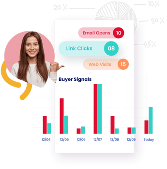
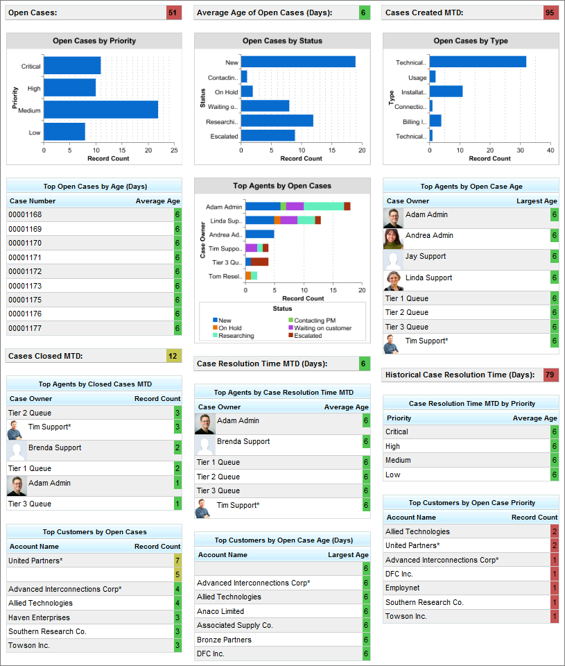
5. Customer Activity Dashboard
It’s time to focus on the customers.
You need to understand who’s making what purchases and when for any business model to succeed. Once you identify your audience, you can hone in on their needs. From customer service to activity, you can use a dashboard to identify each element of interaction successfully.
What is it?
The customer activity dashboard focuses on all the data surrounding customer interaction. It analyzes your activity on a daily basis by looking at performance and how many leads are converting to sales.
There are different dashboards relating to various aspects of your business, such as:
- Emails: Exports your dashboard by email and sends clients fully detailed reports.
- Phone Calls: The average salesperson has six calls a day, which needs tracking.
- Meetings: Provides detailed analysis of the amount of quality time you are spending with customers and prospects. With Calendar Scheduling tools in place, organizations can also set and automatically capture meetings by stage to get a better picture of deal progression to drive more accurate forecasting.
- Customer KPIs: Uses factors such as customer reply time and resolution time so you can see their relation to the conversion rate.
With those metrics, you’ll be able to identify key areas for improvement.
Why use it?
The customer activity dashboard delivers results to a schedule, collecting all of your customer data in one place. By viewing that data — including who your important customers are — you can then target your efforts. From that, you can then create a more effective growth plan.
Here are a few areas the customer activity dashboard can help improve:
- Campaigns & Cadences: Concentrate efforts on your target audience.
- Customer Service: Ensure you’re responding to customer queries and getting back to them quickly.
- Customer Satisfaction: Meet your customers’ needs using the data and feedback. Are we in contact with customers when we should be and are we executing on the right amount of touches?
- Sales Process: Are we following a solid process with every customer to ensure great CX.
By maintaining customer retention, you can use it to understand your target audience fully. Whether you’re an e-commerce business selling online or face-to-face, it keeps you updated in real-time. Knowing where the market lies, you can follow it, making the most of all customer data given.
Salesforce Dashboard Main Components
Salesforce dashboards are made up of several key components that work together to deliver actionable sales insights. Each element plays a specific role in helping sales teams monitor performance, manage leads, and make smarter, faster decisions.
1. Reports
Every dashboard is powered by reports. These are the data sources that feed your charts and tables. By creating tailored reports—such as opportunities by stage or activities by rep—you lay the foundation for tracking KPIs that matter to your sales goals.
2. Charts
Charts turn raw report data into visual insights. Bar charts, pie charts, line graphs, and funnel visuals make it easy to spot trends, compare performance, and analyze key metrics like revenue growth or lead conversion.
3. Tables
Tables present data in a structured, easy-to-read format. They’re ideal for showing lists—such as top-performing reps, overdue deals, or accounts with the highest lifetime value—helping managers quickly prioritize follow-up actions.
4. Gauges and Metrics
Gauge and metric components offer a quick snapshot of progress toward a specific target. They’re especially useful for tracking quota attainment, team goals, or real-time performance against benchmarks.
5. Filters
Dashboard filters let users segment data without duplicating reports. Whether you want to view pipeline health by region, rep, or product line, filters allow for dynamic, on-the-fly analysis to support smarter decision-making.
Key Takeaways
Salesforce dashboards are essential tools for sales teams and business leaders looking to improve visibility, performance, and decision-making. Here’s a quick recap of what makes them so impactful:
-
Track real-time sales performance using customizable dashboards built from key Salesforce reports.
-
Visualize your sales funnel, pipeline, and forecast to identify opportunities, spot risks, and drive better outcomes.
-
Leverage dashboard components like charts, tables, gauges, and filters to surface insights that matter most to your team.
-
Create dashboards quickly and easily with step-by-step setup tools that require no coding—just drag, drop, and customize.
-
Boost team productivity and alignment by making data accessible and actionable across your entire sales organization.
-
Enhance sales decision-making by focusing on high-impact dashboards such as Sales Funnel, Forecast, Leadership, Pipeline, and Customer Activity.
Whether you’re building your first Salesforce dashboard or optimizing existing ones, the right setup can unlock new levels of efficiency and growth.
Frequently Asked Questions (FAQs)
What is the purpose of dashboards in Salesforce?
Dashboards in Salesforce provide a visual summary of key metrics, helping sales teams monitor performance, track progress, and make data-driven decisions in real time.
What are the different types of dashboards in Salesforce?
Salesforce offers several types, including Sales Funnel, Forecast, Pipeline, Leadership, and Customer Activity dashboards—each designed to highlight different stages of the sales process and team performance.
When should you create a Salesforce dashboard?
Create a dashboard when you need real-time visibility into specific sales metrics—such as pipeline health, quota attainment, or lead activity—to support forecasting and strategic planning.
What is the difference between a report and a dashboard in Salesforce?
A report shows raw, detailed data in table form, while a dashboard aggregates multiple reports into visual components like charts and graphs for at-a-glance analysis.
What are the limitations of dashboards in Salesforce?
Salesforce dashboards are limited by the number of components (20 per dashboard), refresh frequency (especially in standard editions), and reliance on summary or matrix report formats.
What is a dynamic dashboard in Salesforce?
A dynamic dashboard displays data based on the viewing user’s access and role, making it easy to share one dashboard with personalized views for each team member.

Have Total Visibility on the Life Cycle of All Your Accounts